Elaine A.C. Albers, MSc, and Kelly M. de Ligt, PhD
Department of Psychosocial Research, Division of Psychosocial Research and Epidemiology, The Netherlands Cancer Institute, Amsterdam, The Netherlands
Following the publication in Journal of Patient-Reported Outcomes: “Visualization formats of patient-reported outcome measures in clinical practice: a systematic review about preferences and interpretation accuracy.” Full article available here.
Making care relevant for patients
To put the patient at the center of care, there is a growing interest in measuring what matters most to patients. Patient-reported outcomes measures (PROMs) are a way to measure information about health and symptoms provided directly by the patient. This reflects their personal perspective on their health. By reporting PROMs data to patients and clinicians, and discussing this during clinical consultations, patients’ satisfaction with care, their quality of life, and communication with their physician can improve.
Various ways to present PROMs data
Various formats are used to visually present PROMs data to patients and clinicians. To use PROMs information in decisions about the patient’s health and treatment, it is important that patients and clinicians correctly interpret the presented data. Is there a best way to present PROMs data? We summarized the latest evidence about ways to visualize PROMs data. We looked into preferences and interpretation accuracy for patients and clinicians. We also looked into strategies that help with the interpretation of clinical relevance of PROMs scores.
Bars, lines, pies
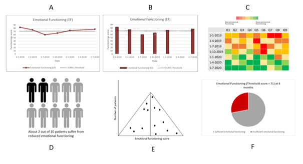
Figure 1 presents different ways to visualize PROMs data. We found that longitudinal data (i.e., multiple measures over time for each patient) was often presented in line graphs, bar charts and heat maps. For cross-sectional data (i.e., one measurement for each patient), icon arrays, funnel plots or pie charts were often used. For the data of an individual patient, patients and clinicians preferred line graphs and bar charts since they are considered to be visually clear. Patients most often interpreted bar charts correctly, while clinicians could adequately interpret all graph formats. To support the interpretation of PROMs, clinically alarming scores can be colored red or circled. For mean PROMs data from a group of patients, pie charts and line graphs were preferred. Here, patients were able to interpret line graphs correctly and clinicians most often interpreted pie charts accurately. In bar or line graphs, including threshold lines can show when a score is better or worse than a set clinical threshold.

Figure 1: Different graphic visualization formats, presenting the domain of ‘emotional functioning’ as an example. Longitudinal: (A) line graph, including threshold line; (B) bar chart, including threshold line; (C) heat map. Cross-sectional: (D) icon array; (E) funnel plot; (F) pie chart.
How to improve the presentation of PROMs data?
The latest research suggests several improvements for the presentation of PROMs data. For instance, graphs should include brief definitions, a short explanation of what is presented, and information on whether a score is considered good or bad. Score scales should be consistent (i.e., always ranging from 0–100) and include descriptive labels. Furthermore, it helps to show only a limited number of symptoms and to ask patients to prioritize the symptoms they want feedback about.
Different people, different ways
Health literacy is the degree to which individuals have the ability to find, understand, and use information and services to inform health-related decisions and actions for themselves and others. Patients with a higher level of health literacy can have different preferences compared to patients with lower levels of health literacy. The latest evidence about presentation of PROMs data often disregarded patients’ health literacy levels. This is an important factor to study. We believe not every patient may benefit from the same format, and so it is important to have various visual presentations for various patients.
Future research about presenting PROMs
Successful implementation of PROMs hinges on more factors than visual presentation of data. It all starts with the perceived value of PROMs for patients and clinicians. How patients value PROMs may determine the interest in their PROMs data. Additionally, patients may have different general knowledge about presentation of data and the content of PROMs data. This can confound how they interpret, understand, and value the presented data and graphs. It is important that this is taken into account for future research.
This newsletter editorial represents the views of the author and does not necessarily reflect the views of ISOQOL.
How to Submit a Newsletter Editorial
Do you have something to share about health related quality of life and patient-centered outcomes? We want to hear from you!
Learn More

The International Society for Quality of Life Research (ISOQOL) is a global community of researchers, clinicians, health care professionals, industry professionals, consultants, and patient research partners advancing health related quality of life research (HRQL).
Together, we are creating a future in which patient perspective is integral to health research, care and policy.
